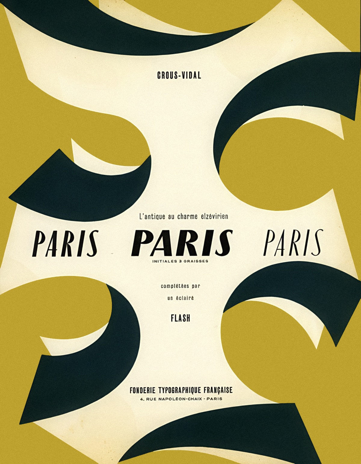
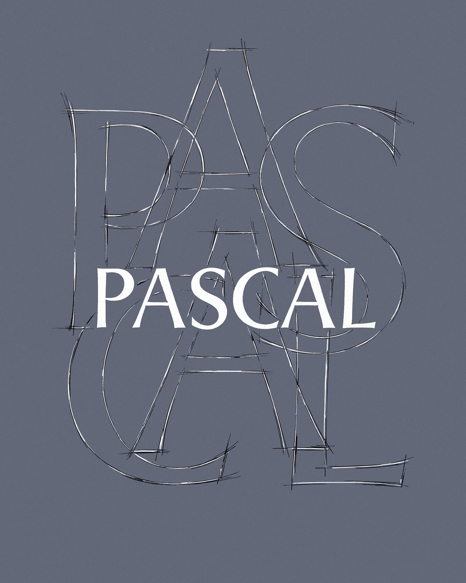
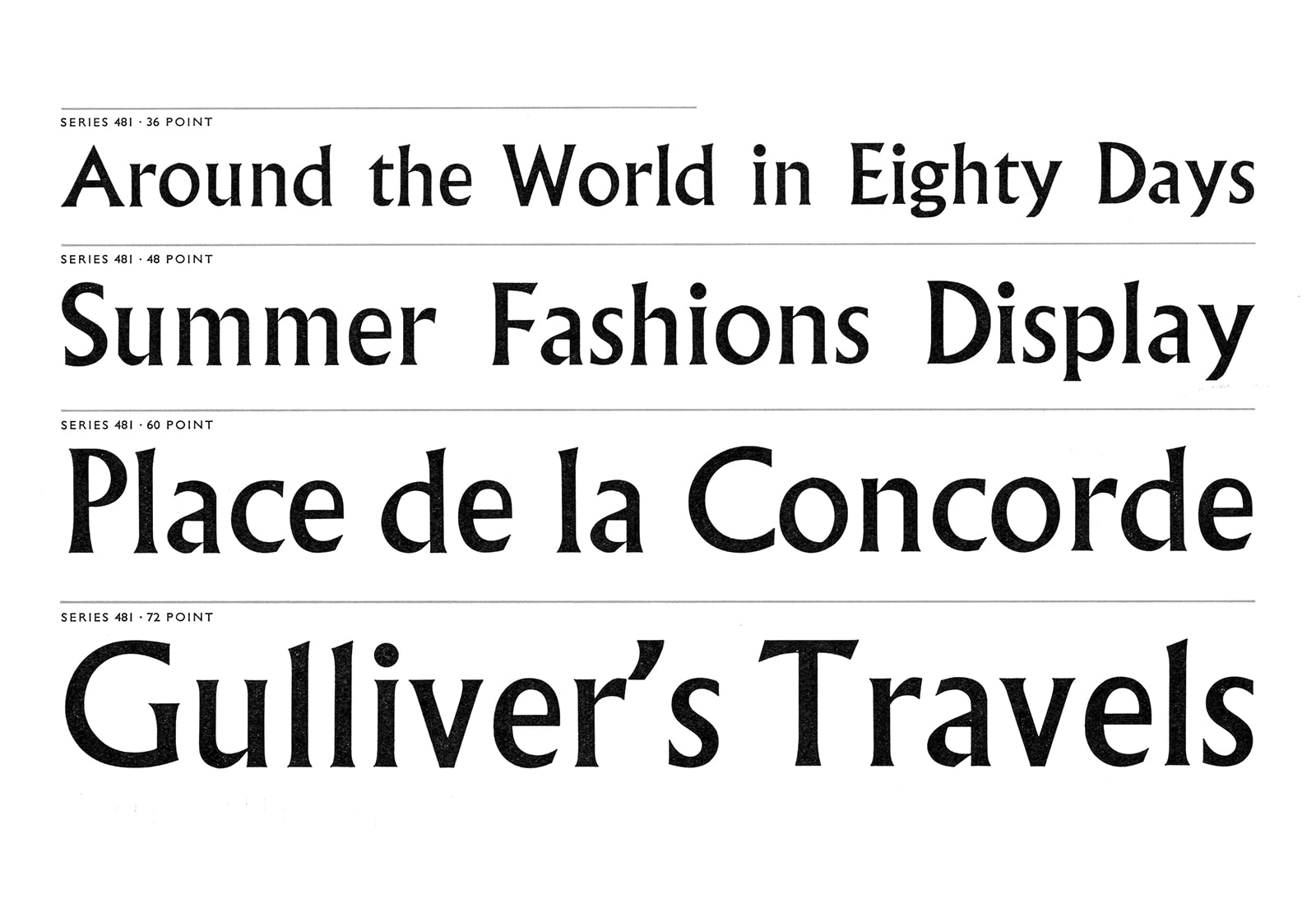
AVEC was inspired by the expressive European humanist lettering of Enric Crous-Vidal and the short-lived Graphie Latine movement of the late 1950 and early 60s. Designed by Hugh Morse for both display and text use, Avec is available in four subfamilies of 14 styles each, with over 790 glyphs per style and variable fonts on a weight axis.

    Sweeping Curves & Sharp Points

    Avec was inspired the distinctive sweeping graphic curves and sharp points that appear in the posters, arabesques and alphabets of Spanish émigré designer Enric Crous-Vidal. Highly fashionable in Paris, his unashamedly ornamental his type designs were also daringly modern in their rejection of conventional serif and sans serif classifications. Cassandre’s use of serifless Roman lettering for his Yves Saint Laurent monogram (1961) testifies to the chic appeal of the style.

    Île-de-France by Enric Crous-Vidal (1960)
      Paris by Enric Crous-Vidal (1953)
        Yves Saint Laurent logo by A.M. Cassandre (1961)

          La Graphie Latine

          In response to the commercial threat of new German and Swiss grotesks and the arrival of phototypesetting (which it was believed could not faithfully reproduce traditional serifs), influential figures in the French type industry hoped to establish a new, uniquely Mediterranean style of type as an alternative to neo-grotesks like Univers and Folio (both 1957), which were seen as too austere to communicate the cultural heritage and sensibilities of the Romance languages. Crous-Vidal, supported by Maximilien Vox and others at the annual Rencontres Internationales de Lure, founded the Graphie Latine movement to promote the cause.

          The group sought to establish the serifless Roman style as the future voice of Latin typography. Named ‘Incised’ by Vox, for its lapidary influences (chiefly classical glyphic lettering), the style was also influenced by several interwar typefaces, including Stellar (1929), Albertus (1932) and Colonia (1938).

          Les Recontres internationales de Lure

            In and Out of Fashion

            Bold but short-lived, la Graphie Latine ended not for lack of creative will, but due to changing fashion. Always a strong flavour, the movement’s stylistic flair also limited its appeal next to more neutral neo-grotesks. Still, there’s something about those sweeping curves. José Mendoza y Almeida, whose Pascal (1962) is something of a forgotten classic of the movement, also designed the much loved Calypso (1958) with Roger Excoffon. And a more joyful celebration of the curve it’s hard to find.

            Calypso by Roger Excoffon (1958)
            Calypso by Roger Excoffon (1958)
            Pascal by José Mendoza y Almeida (1962)
            Pascal by José Mendoza y Almeida (1962)
            Albertus by Berthold Wolpe (1932)
            Albertus by Berthold Wolpe (1932)

            Display and Text

            Although largely inspired by expressive display type, Avec was conceived as an extended family for both display and text. The four subfamilies are optimised for a range of scales: Stencil for headlines, Curve and Sharp for larger text sizes, subheads and up, then down to as little as 6pt for the Text subfamily.

              Flaring Up

              Although serifless, Avec retains the humanistic proportions and contrasting stroke weight of a Roman serif. These characteristics lend it something of the heritage feel of a serif, while adding personality to the characters that are typically less expressive in a sans serif.

              AVEC SHARP · Light · Subtle flaring
                AVEC SHARP · Black · More pronounced flaring

                  Humanist Modularity

                  Avec’s personality is defined by the contrast between the inherent characteristics of serif and sans serif. There’s a deliberate tension between its modularity and the humanistic detailing in its varied stroke weights and angles of stress, and the meticulous adjustments applied to each letterform.

                  Humanist construction – varied angle of stress
                    Recurring shapes adjusted for each letterform

                      Curved & Sharp

                      The Curve and Sharp subfamilies are two sides of the same coin. Although they share the same proportions, weight and contrast, their personalities diverge due to subtle differences in detailing: Where Curved has a refined and classically elegant personality, Sharp has a more graphic feel and a bolder attitude.

                      Curve → Sharp · Light · Bezier details
                        Curve → Sharp · Bold · Bezier details

                          Text Alert

                          Although superficially similar to the Curve subfamily, Avec Text features significant adjustments to optimise legibility at small sizes. These include a greater x-height, higher ascenders and descenders, wider spacing, lower contrast, and a wider and more uniform uppercase.

                            A Collection of Shapes

                            Avec Stencil is a celebration of those distinctive graphic shapes by Enric Crous-Vidal that first inspired the design. Stencil is based on the Sharp subfamily, again with significant optical adjustments applied to each and every character.

                            AVEC STENCIL · A collection of shapes
                              Optical adjustment of stencil breaks

                                So Inclined

                                The accompanying italics are optically corrected obliques, set at a mild 9º angle. As with other serifless romans, the italics share the same characteristics as the roman styles, allowing seamless transitions between the two. The roman and italics also share alternates, with the lowercase a and j showing an extra hint cursive detailing.

                                  Alternate Detailing

                                  Stylistic sets include additional wedge terminals on selected upper and lowercase characters and numerals, titling dieresis, black and white circled characters, and proportional, tabular and old style numerals.

                                  A B
                                  ss.01 - Wedge Alternatives
                                  • ON
                                  • OFF
                                  A B
                                  ss.02 - Pointed W & w
                                  • ON
                                  • OFF
                                  A B
                                  ss.03+04 - Tailed a & wedge a
                                  • ON
                                  • OFF
                                  A B
                                  ss.05 - Tilting dieresis
                                  • ON
                                  • OFF
                                  A B
                                  ss.06 - Slashed zero
                                  • ON
                                  • OFF
                                  A B
                                  ss.07 - Alternate 1
                                  • ON
                                  • OFF
                                  A B
                                  ss.08 - Round punctuation
                                  • ON
                                  • OFF
                                  A B
                                  ss.09 - Thin punctuation
                                  • ON
                                  • OFF
                                  A B
                                  ss.10+11 - Circled characters
                                  • ON
                                  • OFF

                                  Specimen download

                                  Download a PDF specimen to view all the important information in one place – samples of every style in the family, character sets, OpenType features, language coverage and details of every available license.