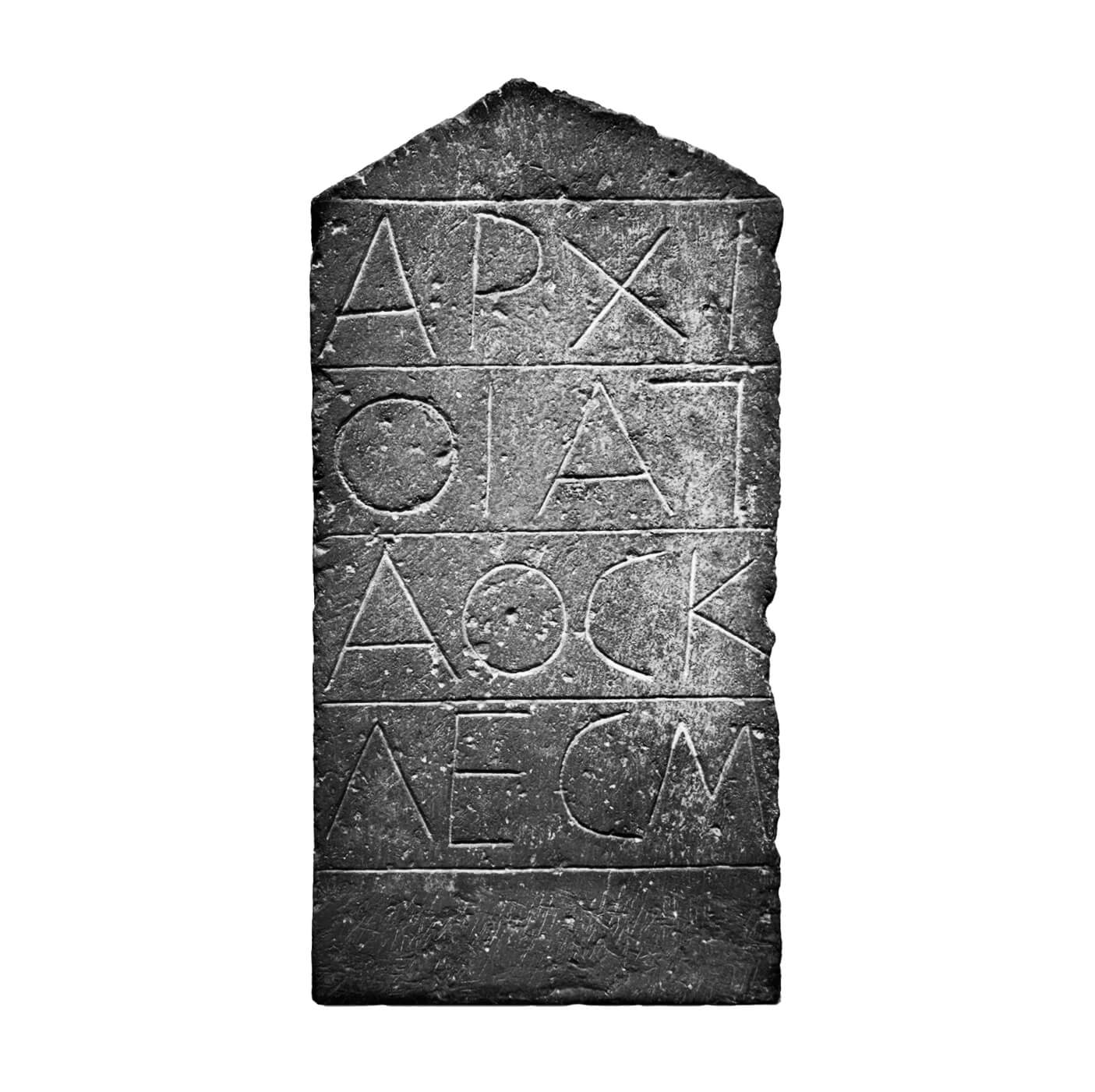
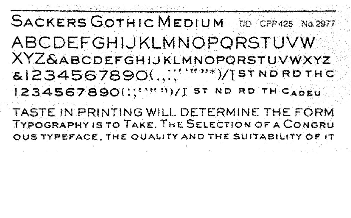
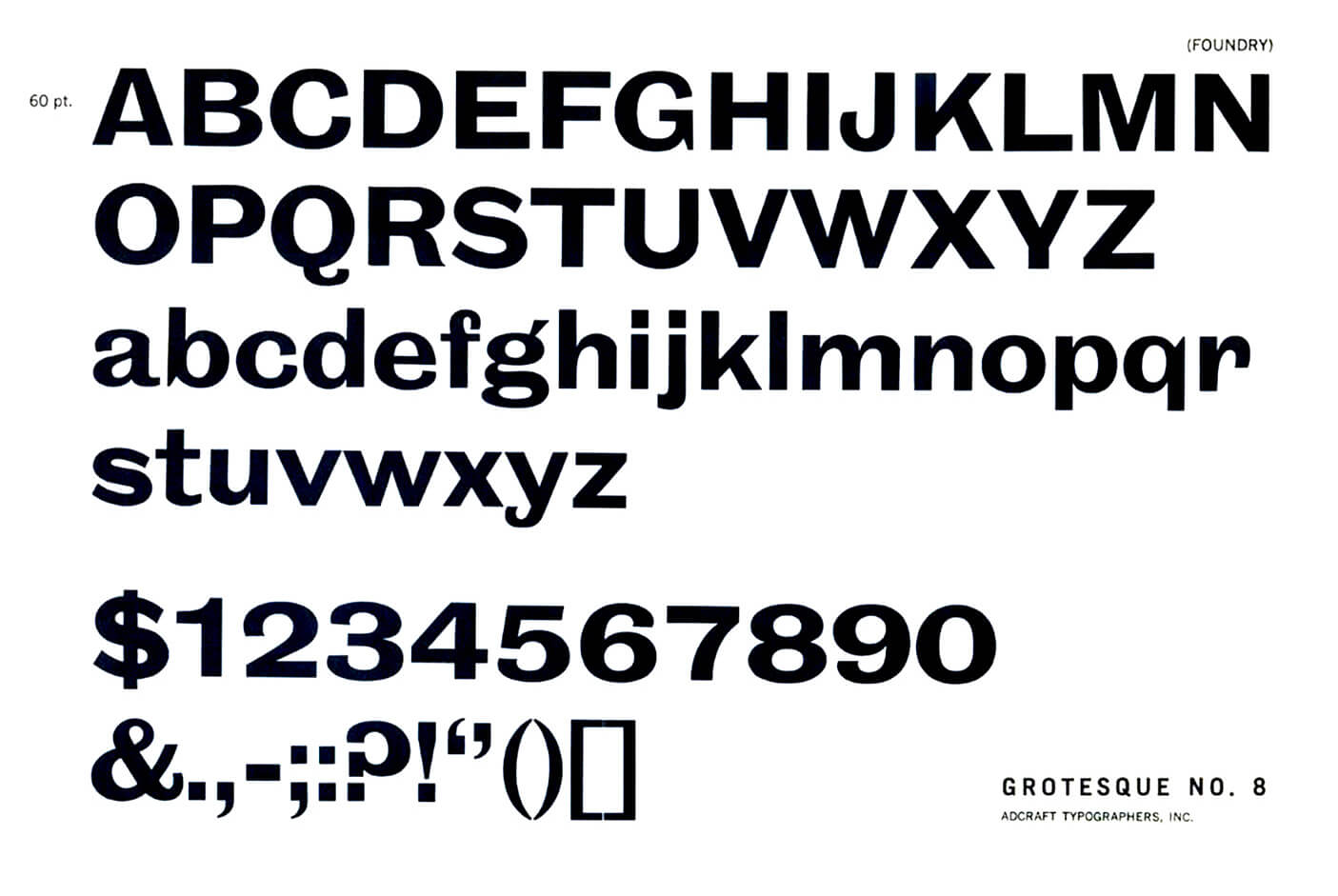
Rework is a historical hybrid; a descendant of a style of a robust, geometric sans that stretches from Ancient Greek stone inscriptions to the modern era by way of 19th century architectural lettering, the earliest printed grotesques, copperplate engraving, and 20th century phototypesetting.

Available in 48 styles and four optical sizes, including a Micro family, Rework is a modern workhorse, designed to perform impeccably at any scale, from monumental to miniscule.

    Shaped over time

    Rework carries the accumulated influence of multiple eras and processes. From the stately, square proportions of ancient monumental Greco-Roman inscription, to its 19th century revivals, as commercial architectural lettering, or as William Caslon IV’s Two Lines English Egyptian, the very first printed sans.

    While the influence of copperplate engraved type and its later phototypeset counterparts (such as Gary Sackers’ eponymous Gothic) is evident Rework’s uppercase, the lowercase draws from the idiosyncratic character of Stephenson Blake’s 19th century Grotesques.

      A B C
      Two Lines English Egyptian
      • A
      • B
      • C
      A B
      Found type on Portobello Road
      • A
      • B

          Part man, part machine

          Rework’s personality is defined by its contrasting industrial and humanistic qualities. The processes that shaped its ancestors – stone carving, metal type, copperplate engraving, phototypesetting – each leave their mark, giving Rework a decidedly pre-digital feel and a sense of robust physicality.

          Rework’s more overtly mechanical traits – its perpendicular terminals, and the slightly squared ovals of its rounded characters – are tempered by the humanistic proportions of its uppercase, and moments of irregularity and unexpected contrast in the lowercase letterforms.

          It’s this combination of qualities that lends Rework the feel of a thing shaped over time; revised, rebuilt, and reconditioned. Like a perpetual work-in-progress for a world that’s always changing.

          Rework Display: Regular
            A B
            Rework’s box-like forms
            • A
            • B
            Rework V1 vs Final

              Leaning in

              Rework’s italics are optically adjusted obliques, set at a consistent 12º angle across all four optical sizes to allow easy combinations of styles.

              Rework Subhead: Regular + Italic

                Style it out

                Rework’s stylistic sets include alternate single story a and g characters, alternate punctuation, slanted currency, and titling dieresis to allow tight uppercase line spacing. All alternates feature matching small caps, subscript and superscript characters.

                A B
                ss.01 - Alternate G
                • ON
                • OFF
                A B
                ss.02 - Alternate Q
                • ON
                • OFF
                A B
                ss.03+04 - Single storey a+g
                • ON
                • OFF
                A B
                ss.05 - Alternate question mark
                • ON
                • OFF
                A B
                ss.06 - Slanted currency
                • ON
                • OFF
                A B
                ss.07 - Alternate arrows
                • ON
                • OFF
                A B
                ss.08 - Alternate ampersand
                • ON
                • OFF
                A B
                ss.09 - Titling dieresis
                • ON
                • OFF

                From miniscule to monumental

                With four optical sizes to choose from, Rework offers uncommon versatility and performance at any scale. Subtle adjustments of proportion and scale are more pronounced with each ascending optical size: letterforms become more condensed, spacing tighter, ascenders and descenders shorten, contrast increases, and apertures begin to close up.

                A
                MacGyver
                Signal
                • Rework Micro
                • Rework Text
                • Rework Headline
                • Rework Display
                A B
                Rework Micro & Display: Regular
                • A
                • B

                Tonnes of character

                Rework offers an extensive 1080 glyphs per style, including many features uncommonly associated with a sans serif of this style: small caps, old style figures, subscripts and superscripts, broad linguistic coverage and a large selection of shapes.

                A
                Ä

                Working at any size

                Although Rework’s Micro and Text family are designed for optimised legibility at smaller sizes, they can be equally effective at larger scale. With robust detailing and distinctive reverse-ink traps, either family can offer a characterful alternative to the Headline and Display families when used at larger sizes.

                Rework Micro: Semibold

                  Specimen download

                  Download a PDF specimen to view all the important information in one place – samples of every style in the family, character sets, OpenType features, language coverage and details of every available license.

                    Sociotype Journal Issue #2:
                    “Makeshift”

                    EDITION OF 1,500 COPIES
                    240 PAGES • 210 x 275 MM
                    ISSN 2754-7698

                    SECTION SEWN, PRINTED IN 4 COLOURS
                    + A FLUORESCENT PANTONE

                    EDITION OF 1,500 COPIES
                    240 PAGES • 210 x 275 MM
                    ISSN 2754-7698

                    SECTION SEWN, PRINTED IN 4 COLOURS
                    + A FLUORESCENT PANTONE

                    DESIGNED AND PRINTED IN THE UK
                    ON FSC RECYCLED PAPERS BY FEDRIGONI