Onsite combines the enduring style of a mid 20th-century grotesk with the industrial feel and systematic range of widths inspired by German road signage. Originally designed in just two styles for our own in-house use at Sociotype, Onsite has grown into a family of three widths and 42 styles, with 766 glyphs per style.

    An uncommon grotesk

    Although loosely based on the evergreen model established by Max Meidinger’s Neue Haas Grotesk, Onsite is no revival. Its subtly squared letterforms and trios of widths recall the industrial feel and systematic structure of another 20th century icon, DIN 1451. There’s even a playful hint of the retro futurist attitude of Aldo Novarese’s Eurostile in the flat-bottomed alternates.

    Ultimately though, Onsite’s possesses a personality all of its own. Its stable, robust form offers faultless legibility for small text, while its most distinctive detailing – subtly flattened curves and apexes, double-point structure and almost imperceptibly flared terminals – emerges at display sizes.

    ONSITE STANDARD · Bold

        A Character Study

        Take a closer look at several of Onsite’s individual characters, and it peels further away from its mid-century origins. An unusually warm personality emerges from its various idiosyncrasies: the jauntily bootcut leg of the uppercase R; the lollipop-like uppercase Q; the deliberate curves of the pound sterling symbol projecting a greater sense of personality (and fun?) than one could reasonably expect from a currency symbol.

        ONSITE STANDARD · Medium

          Set for anything

          Onsite boasts 16 stylistic sets, including several alternates that push the squarish form to a retro-futuristic extreme, including flat-bottomed g, y and J, and a squared ampersand and @ symbol. For more common use, there’s also a single-story a, double-story g and alternate numerals.

          A B
          ss.01+03+04 - Single storey a, flat g & y
          • ON
          • OFF
          A B
          ss.05 - Alternate ß
          • ON
          • OFF
          A B
          ss.02 - Double storey g
          • ON
          • OFF
          A B
          ss.02 - Flat J
          • ON
          • OFF
          A B
          ss.09+10 - Closed four + straight seven
          • ON
          • OFF
          A B
          ss.07 - Tilting dieresis
          • ON
          • OFF
          A B
          ss.07 - Slashed zero
          • ON
          • OFF
          A B
          ss.11+12 - Circled numerals: white & black
          • ON
          • OFF
          A B
          ss.13 - Flat ampersand
          • ON
          • OFF
          A B
          ss.14+15 - Alternate @ symbols
          • ON
          • OFF
          A B
          ss.16 - Solid arrows
          • ON
          • OFF

          Extensive Glyph Set

          Onsite offers 766 glyphs per style, including alternates, broad linguistic coverage, old style numerals, two styles of circled numerals, twenty arrows in two styles of arrows and a full lowercase alphabet of superior and inferiors, optically adjusted for each style.

          Uncommonly for a grotesk, Onsite also features discretionary ligatures and a number of unusual glyphs including the ever-useful interrobang and asterism, sumitsukikakko (lenticular brackets), hangul (Korean) brackets. Because you never know what you might need.

            Condensed, Standard, Extended

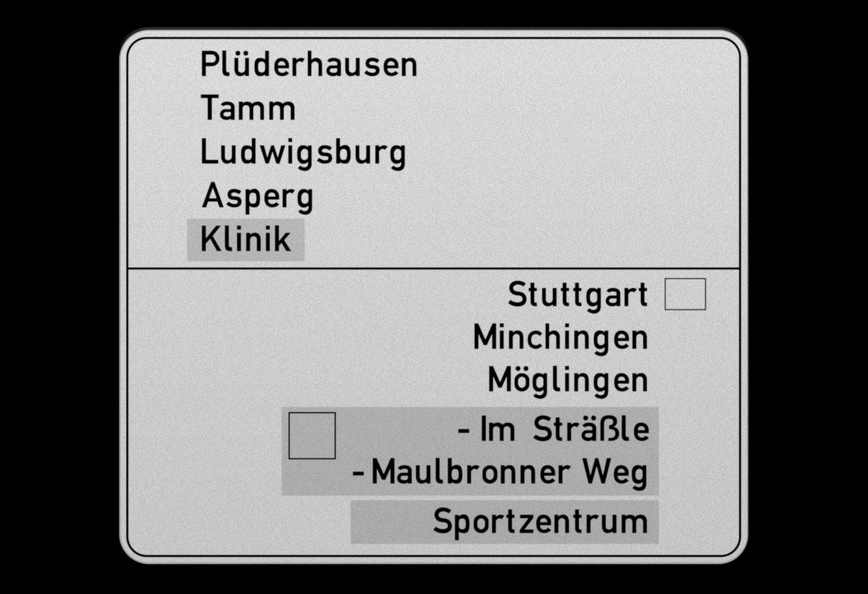
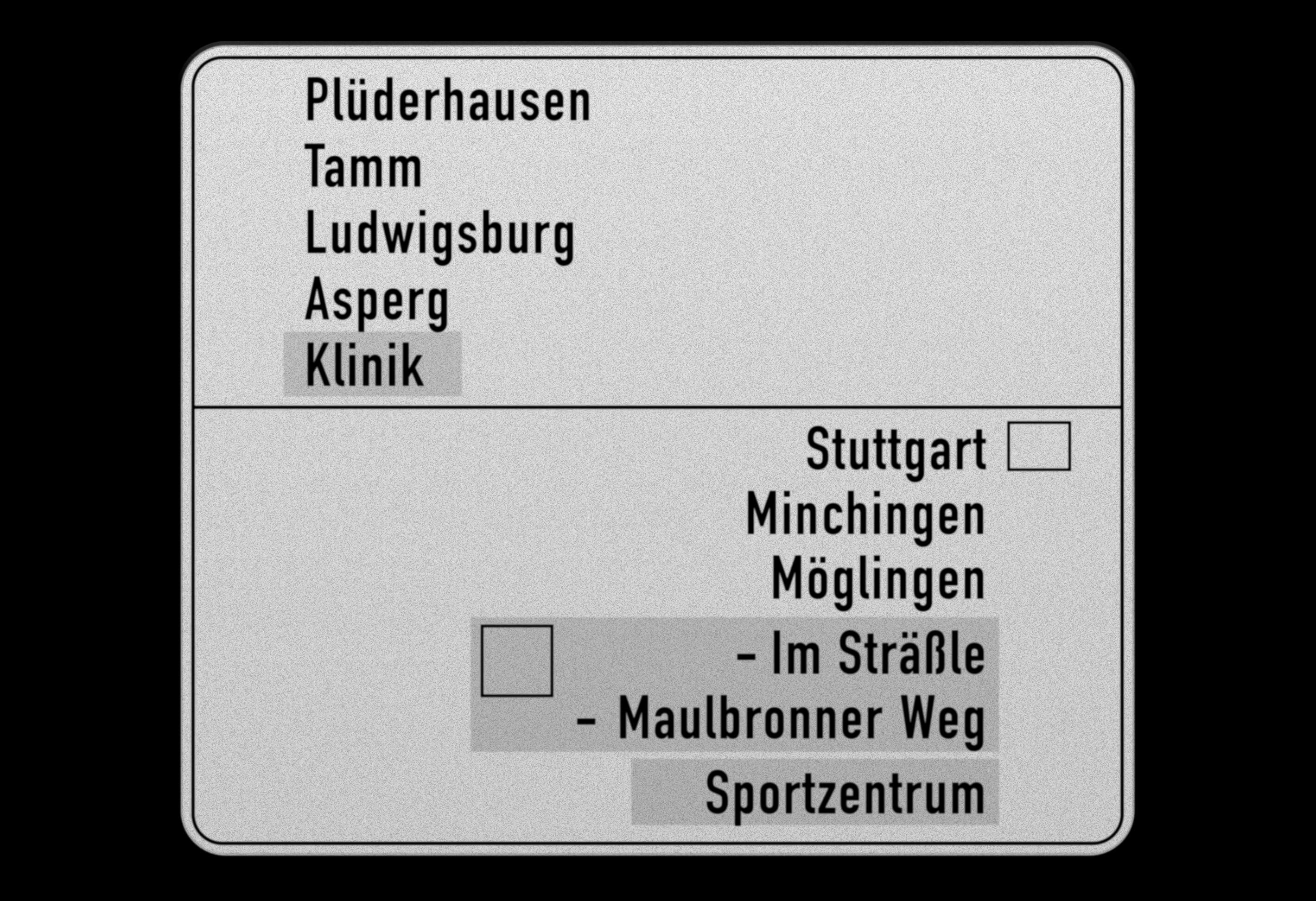
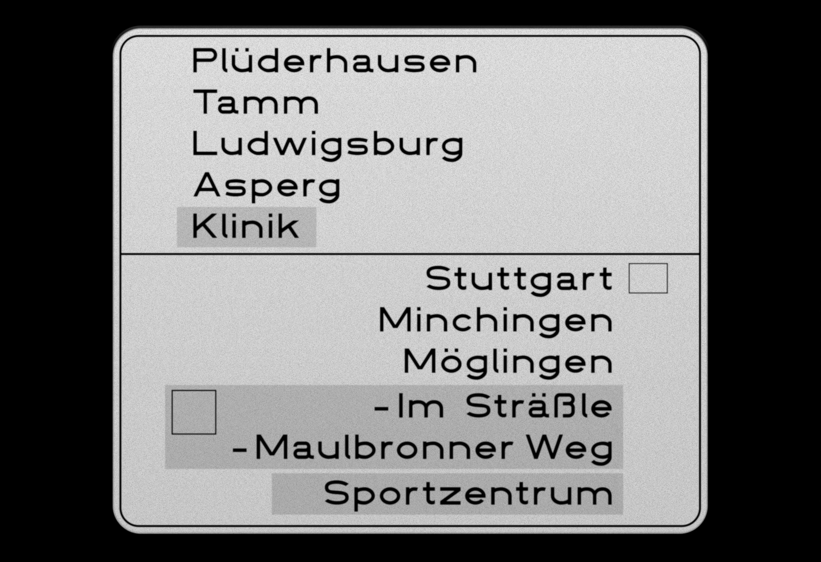
            Just as the Mittelschrift, Engschrift and Breitschrift widths of DIN 1451 could be employed to suit the word length for German road signage, Onsite’s three widths were designed to meet the demands of setting type for a range of digital formats. The three widths are designed to either stand alone and to act in compliment to one another, as required. All three suitable for both text and display use. Variable versions are available with all purchases of font packages, allowing further personalised adjustment.

            A B C
            DIN 1451 · Engschrift
            • A
            • B
            • C
              A
              Panopticon
              Panoptic
              • Onsite Condensed
              • Onsite Standard
              • Onsite Extended

              Thin to Extrabold

              Each of Onsite’s three widths is available in seven weights. Although clearly of the same family, the personalities of each weight are quite distinct, from the skeletal reserve of Thin, to the robustness of Regular and Medium, and the gleeful assertiveness of Extrabold.

              All 7 weights of Onsite Standard
                Optical adjustment across different vertical stem widths

                  Italics to Order

                  True to Onsite’s mid-century origins, its italics are optically adjusted obliques, but with an extreme 15% slant adding a little extra urgency. This fairly drastic angle shapes an italic that cannot be compared to the typical 10 to 12 slant of a Swiss oblique.

                    NEW — Amplified Technicality

                    Onsite Mono is a fixed-width type family that compliments Onsite’s three widths, consisting of the same seven weights found in Onsite’s other subfamilies, along with an additional Book weight. Onsite’s Mono embraces the constraints of fixed-character widths that categorise the monospace style, enhancing Onsite’s existing technical charm.

                    The love-child of Onsite Mono and Onsite Standard, Onsite SemiMono is a unique hybrid that fuses technical nuances of a monospace (prolonged serifs and crossbars) with proportional spacing & kerning lent from Onsite Standard. The subfamily embodies associations and code-like language of a mono, but with none of the drawbacks of fixed-width characters.

                    Both type families have even more Opentype features integrated – From a new serif-bottomed mono f in Stylistic Set 17, to completely custom initial forms within lozenges, in both fill and stroke options.

                    A B
                    Mono → Grotesk · Regular Weights
                    • A
                    • B
                    Onsite Mono · Light to Extrabold
                      A B
                      Custom Circled Initials
                      • A
                      • B

                      Specimen download

                      Download a PDF specimen to view all the important information in one place – samples of every style in the family, character sets, OpenType features, language coverage and details of every available license.