About
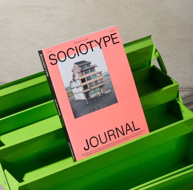
The Condensed subfamily is the most economical mode of the Onsite’s type system. Originally designed in a single weight for captioning alongside Standard, Condensed has a natural affinity with its more generously proportioned siblings, pairing easily in any context. At eighty five percent of the width of Standard (a similar width to DIN’s Mittelshift), Condensed balances a more pronounced vertical rhythm with excellent legibility, its moderate width lending just as well to typesetting extended text as to titling.
14 Styles
- ThinThin Italic
- ExtralightExtralight Italic
- LightLight Italic
- RegularRegular Italic
- MediumMedium Italic
- BoldBold Italic
- ExtraboldExtrabold Italic
Specification
+
A
A
- A
Uppercase
- A
- B
- C
- D
- E
- F
- G
- H
- I
- J
- K
- L
- M
- N
- O
- P
- Q
- R
- S
- T
- U
- V
- W
- X
- Y
- Z
Lowercase
- a
- b
- c
- d
- e
- f
- g
- h
- i
- j
- k
- l
- m
- n
- o
- p
- q
- r
- s
- t
- u
- v
- w
- x
- y
- z
Accented Uppercase
- À
- Á
- Â
- Ã
- Ä
- Å
- Ā
- Ă
- Ą
- Æ
- Ç
- Ć
- Ĉ
- Ċ
- Č
- Ď
- Đ
- È
- É
- Ê
- Ë
- Ē
- Ĕ
- Ė
- Ę
- Ě
- Ĝ
- Ğ
- Ġ
- Ģ
- Ĥ
- Ħ
- Ì
- Í
- Î
- Ï
- Ĩ
- Ī
- Ĭ
- Į
- İ
- IJ
- Ĵ
- Ķ
- Ĺ
- Ļ
- Ľ
- Ŀ
- Ł
- Ð
- Ñ
- Ń
- Ņ
- Ň
- Ŋ
- Ò
- Ó
- Ô
- Õ
- Ö
- Ō
- Ŏ
- Ő
- Ø
- Ǿ
- Œ
- Þ
- Ŕ
- Ř
- Ś
- Ŝ
- Ş
- Ș
- Š
- ẞ
- Ţ
- Ť
- Ț
- Ŧ
- Ù
- Ú
- Û
- Ü
- Ũ
- Ū
- Ŭ
- Ů
- Ű
- Ų
- Ŵ
- Ẁ
- Ẃ
- Ẅ
- Ý
- Ỳ
- Ŷ
- Ÿ
- Ź
- Ż
- Ž
Accented Lowercase
- à
- á
- â
- ã
- ä
- å
- ā
- ă
- ą
- æ
- ǽ
- ç
- ć
- ĉ
- ċ
- č
- ď
- đ
- è
- é
- ê
- ë
- ē
- ĕ
- ė
- ę
- ě
- ĝ
- ğ
- ġ
- ģ
- ĥ
- ħ
- ì
- í
- î
- ï
- ĩ
- ī
- ĭ
- į
- ı
- ij
- ĵ
- ķ
- ĺ
- ļ
- ľ
- ŀ
- ł
- ð
- ñ
- ń
- ņ
- ň
- ŋ
- ò
- ó
- ô
- õ
- ö
- ō
- ŏ
- ő
- œ
- ø
- þ
- ŕ
- ŗ
- ř
- ś
- ŝ
- ş
- š
- ß
- ţ
- ť
- ŧ
- ù
- ú
- û
- ü
- ũ
- ū
- ŭ
- ů
- ű
- ų
- ŵ
- ẁ
- ẃ
- ẅ
- ý
- ỳ
- ŷ
- ÿ
- ź
- ż
- ž
Default Numerals
- 0
- 1
- 2
- 3
- 4
- 5
- 6
- 7
- 8
- 9
Old Style Numerals
- 0
- 1
- 2
- 3
- 4
- 5
- 6
- 7
- 8
- 9
Light Circled Numerals
- ➀
- ➁
- ➂
- ➃
- ➄
- ➅
- ➆
- ➇
- ➈
Dark Circled Numerals
- ➊
- ➋
- ➌
- ➍
- ➎
- ➏
- ➐
- ➑
- ➒
Punctuation
- .
- ,
- :
- :
- ;
- …
- “
- ”
- ‘
- ’
- „
- ‚
- ‘
- ”
- "
- &
- ?
- !
- ¿
- ¡
- @
- «
- »
- ‹
- ›
- -
- –
- —
- _
- ·
- •
- (
- )
- [
- ]
- {
- }
- 〔
- 〕
- 【
- 】
- /
- |
- \
- #
- ©
- ℗
- ®
- ™
- ℠
- *
- †
- ‡
- §
- ¶
- #
Mathematics + Greek
- <
- >
- ≤
- ≥
- +
- −
- ×
- ÷
- =
- ≠
- ±
- ~
- ≈
- ¬
- ∞
- ⁄
- %
- ‰
- √
- ∫
- ∂
- ∏
- Δ
- Ω
- ∑
- μ
- π
Currency
- ₿
- ฿
- €
- £
- ₦
- ₭
- ¥
- ₽
- ₩
- $
- ¢
- ₫
- ¤
Case Sensitive Forms
- ¿
- ¡
- @
- ‹
- ›
- «
- »
- -
- –
- —
- ·
- (
- )
- [
- ]
- {
- }
- /
- |
- ¦
- \
Arrows + Symbols
- ←
- ↑
- →
- ↓
- ↖
- ↗
- ↘
- ↙
- ↩
- ↪
- ↰
- ↱
- ↲
- ↳
- ↴
-
- ←
- ↑
- →
- ↓
- ↖
- ↗
- ↘
- ↙
- ↩
- ↪
- ↰
- ↱
- ↲
- ↳
- ↴
- ▲
- △
- ▴
- ▵
- ▶
- ▸
- ▹
- ▼
- ▽
- ▾
- ▿
- ◀
- ◂
- ◃
- ◊
- ○
- ●
- ■
- ▪
- ⌂
- ◌
- ⬚
Ligatures
- ff
- ffi
- fi
- fj
- fb
- fl
- ffl
- fh
- fk
- ft
- fft
Superior / Superscript
- 0
- 1
- 2
- 3
- 4
- 5
- 6
- 7
- 8
- 9
- a
- b
- c
- d
- e
- f
- g
- h
- i
- j
- k
- l
- m
- n
- o
- p
- q
- r
- s
- t
- u
- v
- w
- x
- y
- z
- _
- (
- )
- +
- -
- =
Inferior / Subscript
- 0
- 1
- 2
- 3
- 4
- 5
- 6
- 7
- 8
- 9
- a
- b
- c
- d
- e
- f
- g
- h
- i
- j
- k
- l
- m
- n
- o
- p
- q
- r
- s
- t
- u
- v
- w
- x
- y
- z
- _
- (
- )
- +
- -
- =
Pre-Built Fractions
- ½
- ⅓
- ¼
- ⅛
- ⅔
- ¾
- ⅜
- ⅝
- ⅞
Ordinals
- ª
- º
- №
Name
In Use
Standard Ligatures
.liga
Ligatures create a more harmonious design for certain letter combinations. Standard ligatures are activated by default.
Coffin homes
Coffin home
ffi fj
▸
Coffin homes Coffin home ffi fj
Discretionary Ligatures
.dlig
Discretionary ligatures are more decorative than standard ligatures. They can be activated in the OpenType panel.
affluent gifted
Affluent gift
ffl fb
▸
affluent gifted Affluent gift ffl fb
Stylistic Set 01
.ss01
Single storey lowercase a: A simpler, more geometric form. It's recommended to use this in conjunction with the single storey lowercase g (.ss04).
sad landcape
Mechanical
plain
▸
sad landcape Mechanical plain
Stylistic Set 02
.ss02
Double storey lowercase g. A more complex alternate to the (default) single storey g. We recommend using this for display or titling - due to its distinction.
Loitering sign
geographic
edge
▸
Loitering sign geographic edge
Stylistic Set 03
.ss03
Flat lowercase g.It's recommended to use this in conjunction with the flat lowercase y (.ss04) & flat uppercase J (.ss06).
programming
Beginnings
edge
▸
programming Beginnings edge
Stylistic Set 04
.ss04
Flat lowercase y. It's recommended to use this in conjunction with the flat lowercase g (.ss03) & flat uppercase J (.ss06).
crypto-typing
photo-types
type
▸
crypto-typing photo-types type
Stylistic Set 05
.ss05
Alternate angular Eszett. Customisation for our German users.
Weiße Straße
die Straßen
Fluß
▸
Weiße Straße die Straßen Fluß
Stylistic Set 06
.ss06
A flat uppercase J. It's recommended to use this in conjunction with the flat lowercase g (.ss03) & flat lowercase y (.ss04).
Janet Jacobs
Jørgensens
Joint
▸
Janet Jacobs Jørgensens Joint
Stylistic Set 07
.ss07
Titling dieresis - Useful when using dieresis, but tight leading is required.
SCHÖNHEIT
SCHÖNSTE
Ä Ö Ü
▸
SCHÖNHEIT SCHÖNSTE Ä Ö Ü
Stylistic Set 08
.ss08
Slashed zero. This ensures no confusion can be made with the letter o. Also available as separate OpenType feature (.zero).
03 303 00 🄋🄌
02 02 00🄋🄌
000🄌
▸
03 303 00 🄋🄌 02 02 00🄋🄌 000🄌
Stylistic Set 09
.ss09
Closed four. A more generic alternate, that’s typical of a neo-grotesk typeface. Rolled out across all versions of the number.
04 04 4444 ➃➍
14 4 4444 ➃➍
444➍
▸
04 04 4444 ➃➍ 14 4 4444 ➃➍ 444➍
Stylistic Set 10
.ss10
Straight seven. A more generic alternate, that’s typical of a neo-grotesk typeface. Rolled out across all versions of the number.
07 07 7777 ➆➐
117 7 7777➆➐
777➐
▸
07 07 7777 ➆➐ 117 7 7777➆➐ 777➐
Stylistic Set 11
.ss11
Circled Numerals - White. Appropriate for captions or wayfinding signage. These have been optically adjusted to maintain weight after scale has been reduced.
0123456
0123456
123
▸
0123456 0123456 123
Stylistic Set 12
.ss12
Circled Numerals - Black. Appropriate for captions or wayfinding signage. These have been optically adjusted to maintain weight after scale has been reduced.
3456789
3456789
789
▸
3456789 3456789 789
Stylistic Set 13
.ss13
A flat ampersand. It's recommended to use this in conjunction with the flat lowercase g (ss.03) & flat lowercase y (.ss04), and flat uppercase J (.ss06).
Sand & Stone
Mice & Men
A&B
▸
Sand & Stone Mice & Men A&B
Stylistic Set 14
ss14
Squarer @ symbol. One of two ‘techy’ alternates for the @. We recommend using this alongside the other ‘flat’ alternates in both upper and lowercase.
jl@sociotype
jl@s–t.com
@s–t
▸
jl@sociotype jl@s–t.com @s–t
Stylistic Set 15
.ss15
Bracketed @ symbol. One of two ‘techy’ alternates for the @. Optically adjusted to maintain weight after scale has been reduced.
jl@sociotype
hi@st.com
@s-t
▸
jl@sociotype hi@st.com @s-t
Stylistic Set 16
.ss16
Solid arrow heads. These alternates appear to be a little more ‘friendly’ than their default counterparts.
↑↗→↘↓↪↱↴
↑↓→↘↓↪↱
↑↪
▸
↑↗→↘↓↪↱↴ ↑↓→↘↓↪↱ ↑↪
All Caps
.case
Shifts various punctuation marks and brackets to a position that works better with all-capital sequences.
«{[(〔【@st】〕)]}»
{[(〔【@st】〕)]}
[{(〔【h
▸
«{[(〔【@st】〕)]}» {[(〔【@st】〕)]} [{(〔【h
Old Style Figures
.osf
Most suited within body copy, old style figures increase legibility at small scale and reduce emphasis.
0123456789
123456789
1962
▸
0123456789 123456789 1962
Tabular Lining Figures
.tnum
These allow numerals to align when vertically stacked. Brief punctuation ha also been included for use in tables.
0123456789
12345678
1962
▸
0123456789 12345678 1962
Tabular Old Style Figures
tosf
Tabular Old Style Figures is an option when you like the look of figures with varying heights but you need the numbers to line up in columns such as in financial documents, tables, charts, or numbered lists.
0123456789
12345678
1962
▸
0123456789 12345678 1962
Fractions
.numr + .dnom
An OpenType feature that allows endless possibilities for fractions.
1/2 + 345/678
3/4 + 56/178
2/34
▸
1/2 + 345/678 3/4 + 56/178 2/34
Ordinal Indicators
.ordn
Indicators that represent position or rank in a sequential order. Note: Typical ordinals are setup as .ordn, but Onsite has a full lowercase is available within .sups (superscript) and .subs (subscript).
1a 2nd 3rd 4e
1a 2nd 35th
56th
▸
1a 2nd 3rd 4e 1a 2nd 35th 56th
Contextual Alternates
.calt
Within Onsite, these have been used to speed up usage for some common symbols.
<- 87x65x4 ->
<- 543x21 ->
<- ->
▸
<- 87x65x4 -> <- 543x21 -> <- ->
Superscript + Subscript
.sups + .subs
Most often used in formulas, mathematical expressions, and specifications of chemical compounds. The same feature for superior and inferior numerals.
5m2 (CH3+2)
5m2 (C3+2)
o2n3
▸
5m2 (CH3+2) 5m2 (C3+2) o2n3